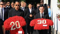
The tombstone for Pope Francis, designed to reflect simplicity, now faces scrutiny due to its unconventional lettering.
Design Controversy: Pope Francis' Tombstone Lettering Sparking Debate

Design Controversy: Pope Francis' Tombstone Lettering Sparking Debate
Irregular spacing of letters raises eyebrows among typography experts.
The inscribed name on Pope Francis’ tombstone has ignited discussions amongst typography enthusiasts, focusing on the irregular spacing of the letters. The tomb, intended to epitomize the Pope's humble style, features the name “Franciscus,” spelled out in a font commonly used in the English language — Times Roman. However, the arrangement appears visually jarring when viewed from above, prompting a critique of the design choices made.
Observers noted that the lettering reads as “F R A NCISC VS” due to its poor kerning. “Woe be unto the person who decided to design it this way,” lamented Charles Nix, a senior creative director at Monotype, the leading typeface company. He described the arrangement as a long-lasting design misstep that could have easily been avoided.
Many see the simple design as befitting Pope Francis’ ethos, yet the execution has stirred discontent. Typography experts argue that the visual impact detracts from the tomb's overall dignity, illustrating that even in life’s final moments, attention to detail matters significantly. The debate over the tombstone’s lettering underscores the broader cultural implications of design, as even the most revered figures can become subjects of critique in the realm of aesthetics and presentation.