In brief
The United Nations has adopted a new world map to correct long‑standing inaccuracies in the Mercator projection, particularly the exaggeration of Africa’s size. The resolution endorses the Equal Earth projection, which balances area across the globe but sacrifices precise navigation. The article reviews the history of the Mercator map, the developments that led to Equal Earth and Peters projections, and explores other alternatives such as azimuthal equidistant and south‑up maps. By examining these options, we see how map choices influence perception, politics, and global data literacy.
For more than four centuries, the Mercator projection has dominated classroom blackboards and Google Maps, promising accurate navigation but betraying the true shape and size of the world. Recent United Nations action, however, signals a shift toward a more truthful representation—one that shifts Africa from the “perceived little continent” to the continent it truly is.
UN’s Resolution For a New Map
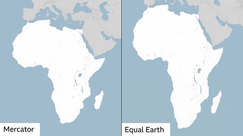
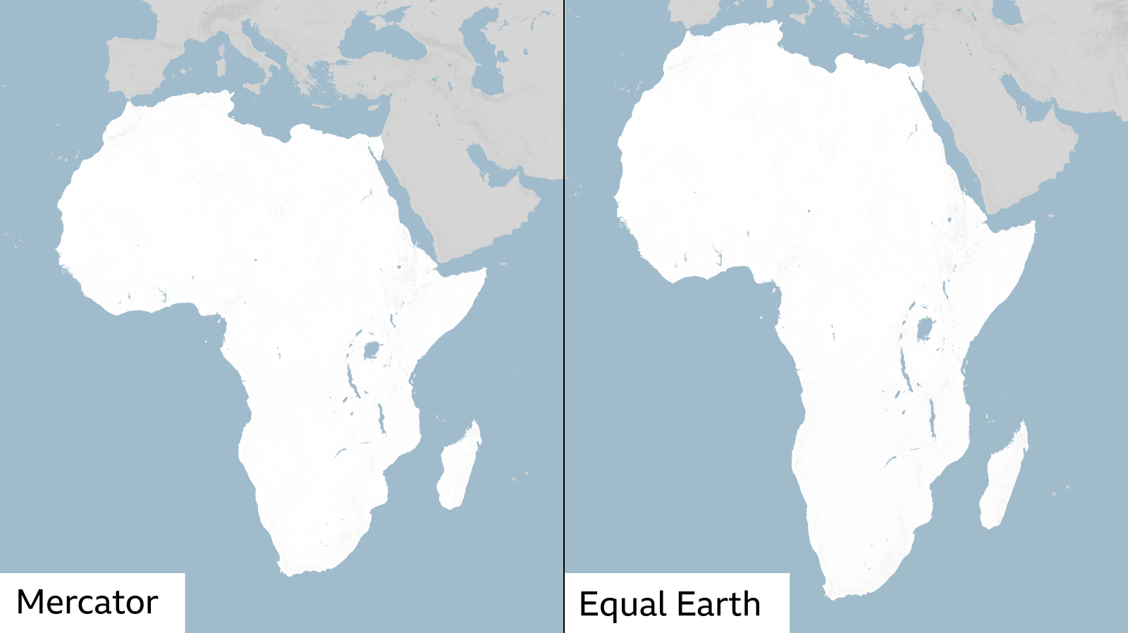
In September 2026 the General Assembly approved a “Correct the Map” resolution, officially adopting the Equal Earth projection as the predominant world map. The goal is to replace the Mercator frame that shows Africa roughly the same size as Greenland, while the continent is actually about fourteen times larger.
The Mercator Projection – The Old Standard
Created in 1569 by Flemish cartographer Gerardus Mercator, this map was engineered to preserve compass bearings, which made sea travel straightforward. To keep straight lines true, Mercator stretches the globe’s latitudinal grid near the poles, enlarging polar regions and shrinking equatorial ones. The effect is a massive distortion that turns the African continent into a fat blot of perceived insignificance.
Equal Earth – A Modern Solution
Developed in 2018 by a team of cartographers, the Equal Earth projection is a modern reflex of the earlier Robinson map. It preserves land‑area accurately while offering a balanced global view. The map was adopted by African Union members in February and is now the official United Nations standard. What it sacrifices is the perfect compass bearings that the Mercator offers; distances between points are no longer legally accurate.
Peters Map – A Different Trade‑off
The Peters projection, introduced by German historian Arno Peters in the 1970s, flips the Mercator’s approach. It keeps area fair at the cost of shape; polar regions shrink and equatorial areas stretch. Its straight lines of latitude and longitude become unusable for navigation because they no longer represent true compass bearings.
Other Projections: Azimuthal Equidistant & South‑Up
The azimuthal equidistant projection places a single centre point—often the North Pole—as the pivot, keeping distances correct from that point. The United Nations flag, for instance, employs this design, centering the globe on the North Pole. A less popular approach, the “south‑up” map rotates the whole globe 180°, placing the Southern Hemisphere on top, which can reveal often‑overlooked southern landscapes.
What the Debate Means for Representation and Perception
Beyond technicalities, the way we map the world shapes political and economic perception. Distortions can marginalise entire regions, as critics argue that a smaller African silhouette underestimates its resources and potential. The UN’s move signals an awareness that maps influence worldview and urges a move toward representations that respect proportion and truth.
For now, the Equal Earth projection may best balance size and shape for everyday users, while navigation and precise scientific measurements still rely on Mercator or other specific projections. The choice of map is no longer a purely aesthetic one—it is a clear stance on how we see, study, and engage with the world.